Code and Data

Code and Data looks at different types of data and graphs. A numeric data set is formatted first and then displayed through code. Three types of graphs are addressed here: Line, Bar and Donut graph.
3 Graphs
We were introduced to line, bar and donut as an exercise to differentiate the uses of each graph.
Line
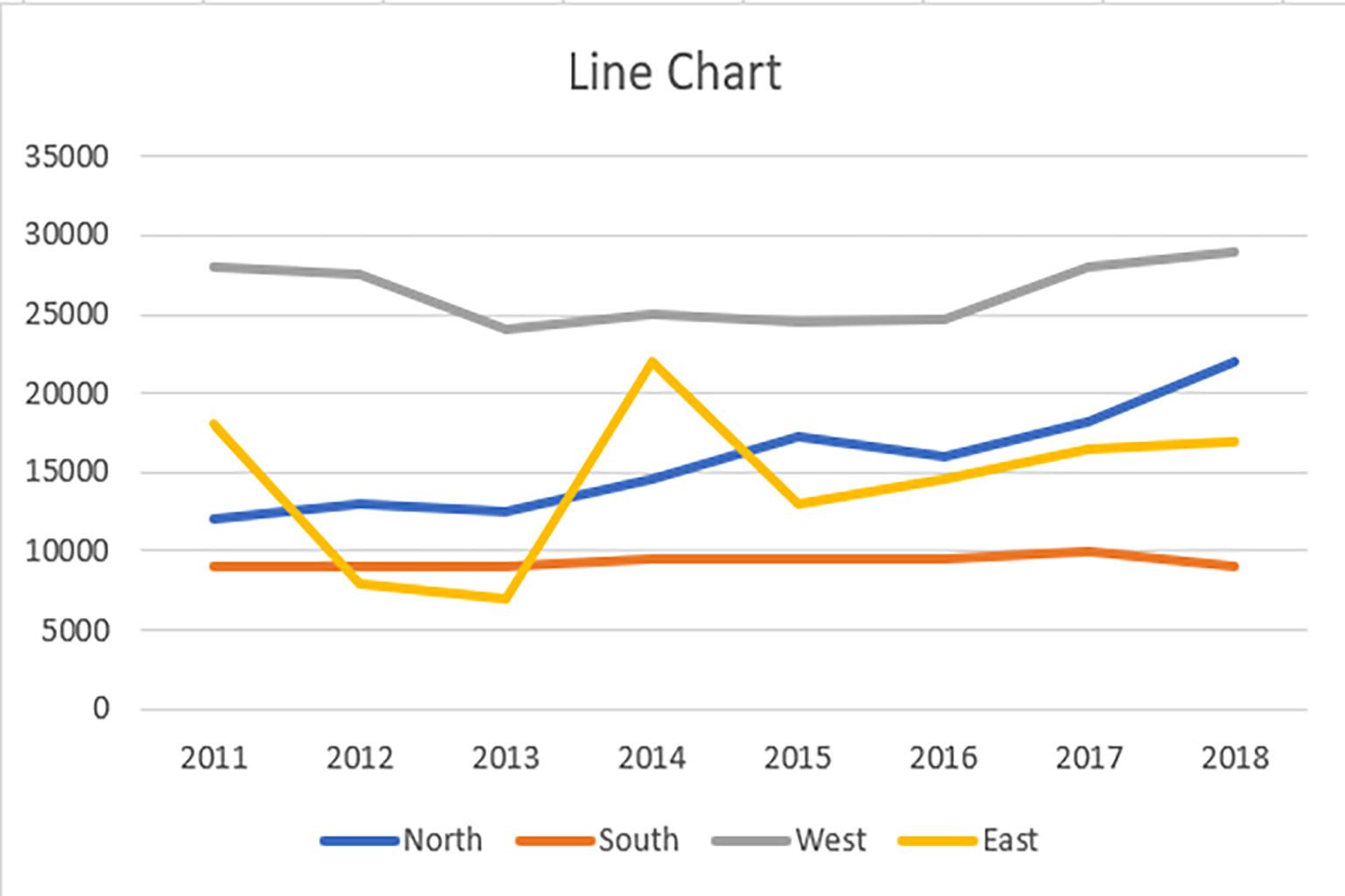
Within a line graph, there are various data points connected together by a straight line that reveals a continuous change in the values represented by the data points.
Family: Function
Usage: Commonly used in statistics, track changes over a periods of time


Bar
A bar chart is a chart that presents categorical data with rectangular bars with heights or lengths proportional to the values that they represent. The bars can be plotted vertically or horizontally.
Family: Chart
Usage: Comparison, Trends Overtime
Donut
A donut chart (also spelled doughnut) is functionally identical to a pie chart, with the exception of a blank center and the ability to support multiple statistics at once. Divided into sectors that each represent a proportion of the whole. It is often used to show percentage, where the sum of the sectors equals 100%.
Family: Chart
Usage: Comparison, Part to whole
Out of all the three graphs, the donut graph is more visually appealing. We could implement 3D shapes and pictorial representations onto it. However, we find that the line graph would be a better option as there are more pros of being readable and it makes things easier to understand by plotting the graph with dots.
Your Data Graph
The Olympic data set gives a full summary of the number of winnings in different countries performed from the founding year in 1896, to the current years of the Olympics event. It showcased the historial numeric data of the winning medals, Gold, Silver and Bronze.
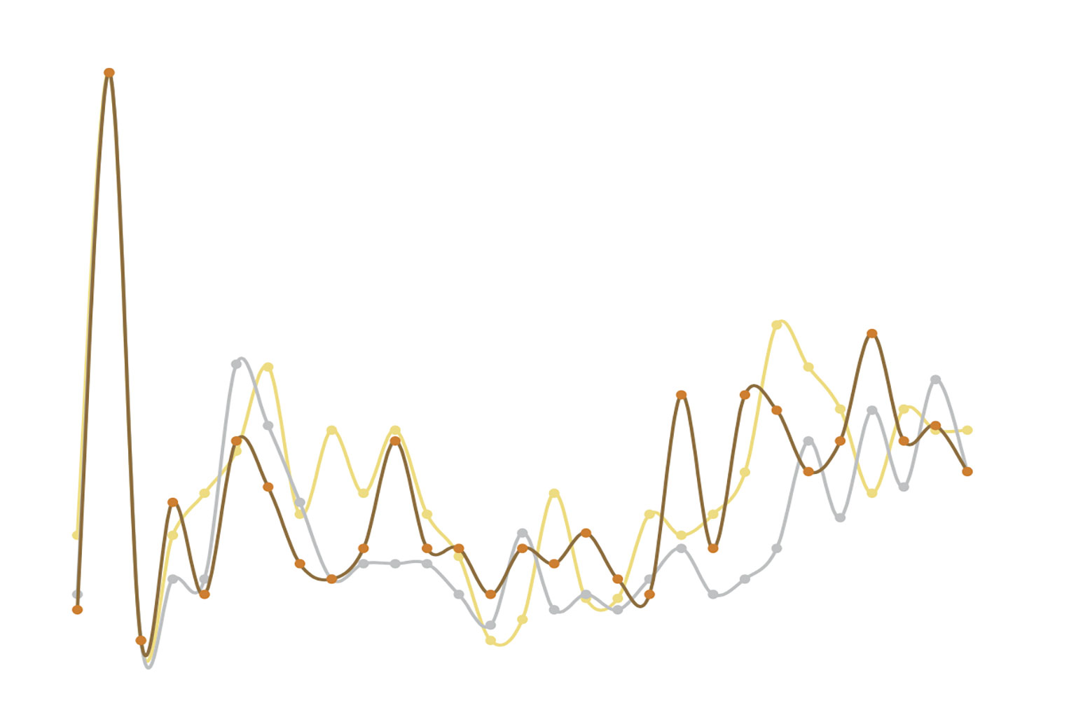
Initial Graph

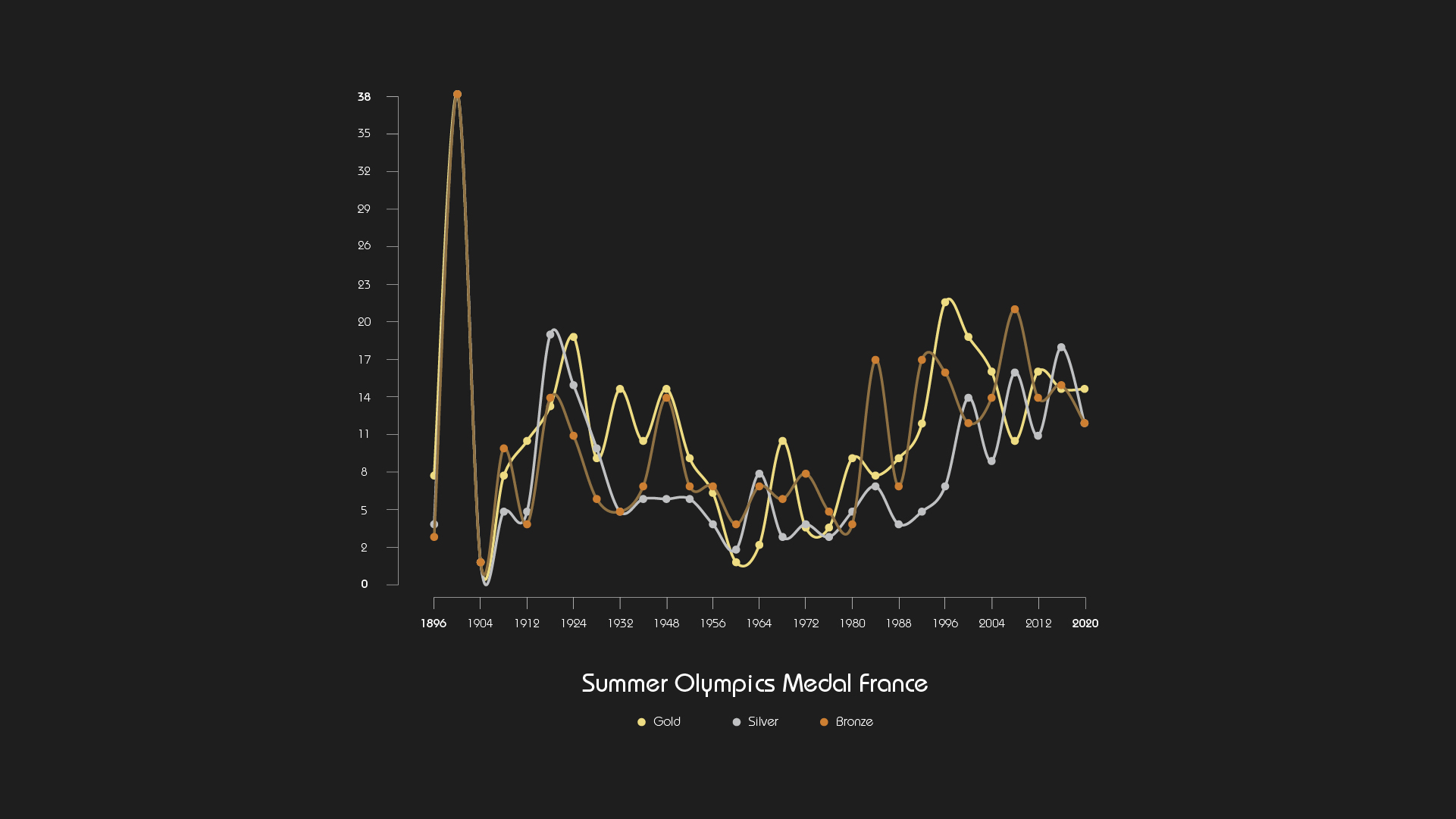
Final Graph

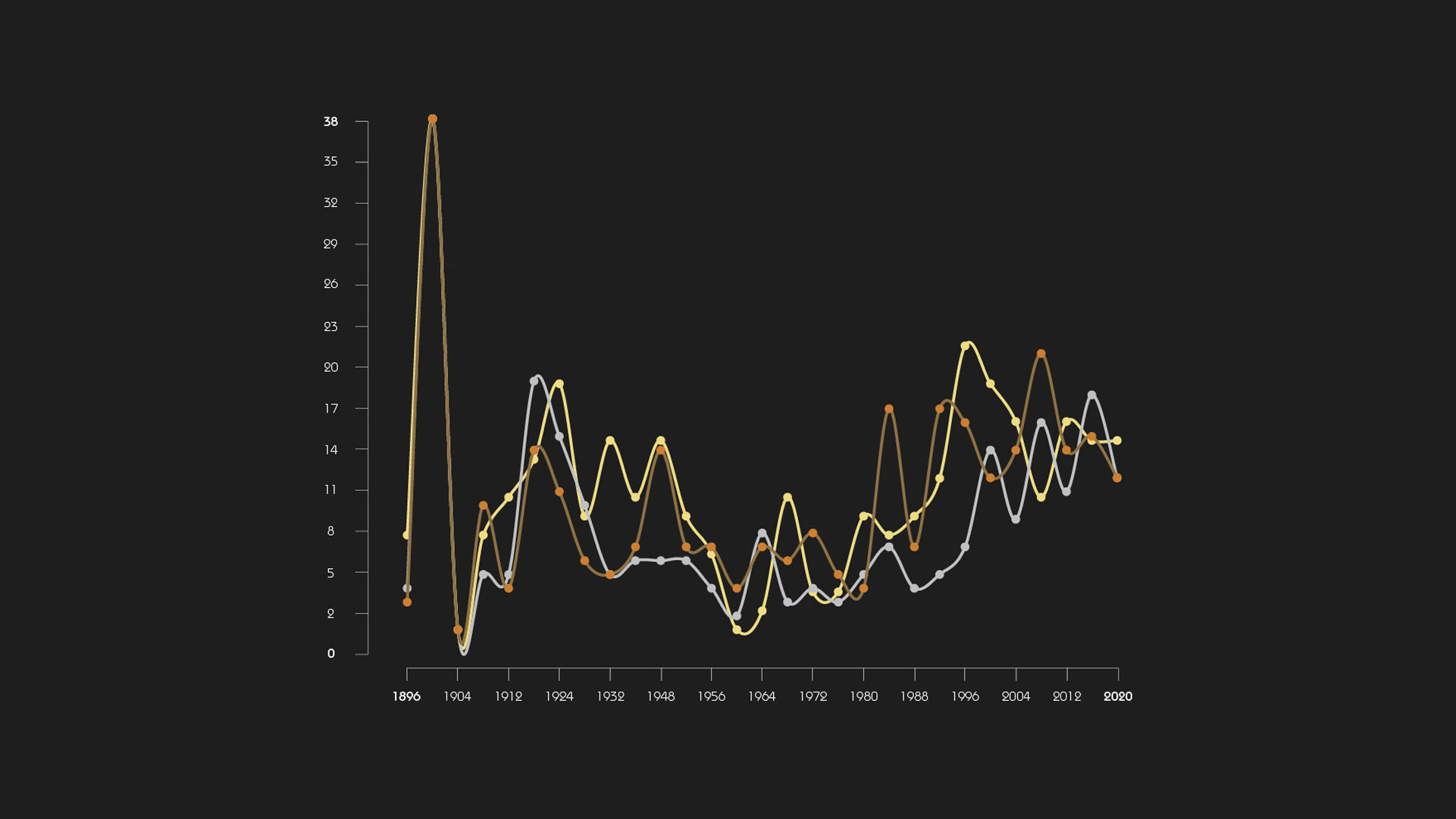
From the graph above we can conclude the following: France won the most in the year 1900, while they won the least in the year 1904.
Below you can find an excerpt from the data we have used. Based on a data set on Summer Olympics Medal - France recorded since 1896, we have extracted the following data points that we have worked with:
| Year | Gold | Silver | Bronze |
|---|---|---|---|
| 1896 | 5 | 4 | 2 |
| 1904 | 0 | 1 | 0 |
| 1912 | 7 | 5 | 3 |
| 1924 | 13 | 15 | 10 |
| 1932 | 10 | 5 | 4 |
| 1948 | 10 | 6 | 13 |
| 1956 | 6 | 6 | 6 |
| 1956 | 6 | 6 | 6 |
| 1964 | 1 | 8 | 6 |
| 1972 | 2 | 4 | 7 |
| 1980 | 6 | 5 | 3 |
| 1988 | 6 | 4 | 6 |
| 1996 | 15 | 7 | 15 |
| 2004 | 11 | 9 | 13 |
| 2012 | 11 | 11 | 13 |
| 2020 | 10 | 12 | 11 |
Data Interpretation
To put it in visually, we use the individual colour schemes that represent gold, silver and bronze in graphical lines. Next, we chose “France” as the main subject on our graph, as the numbers of medals won were shown in diverse numbers throughout the decades. The graphical chart is represented in a horizontal way, that indicates the starting point to the end, according to the years.


